- Supertype
- Product & Services
- Portfolio
- Computer Vision
- Custom BI Development
- Managed Data Analytics & Development
- Programmatic Report Generation
Analytics Products & Services
Data analytics and data engineering services
Data Science by Applications
Implementations of data science in various industries
Bespoke solution for enterprises
Advisory & Consulting
Portfolio & highlights
Curation of featured projects and enterprise work
- Articles
Data Engineering
Technical articles by data engineers & automation developers solving real-world problems
Data Science
Articles and first hand observations by data scientists & analytics experts in the field
Full-Cycle Data Science Consultancy
Data Science & Analytics Consulting
- About
- Contact

DEVELOPING RIVER WATER LEVEL MONITORING SYSTEM USING GOOGLE DATA STUDIO
PART 1: VISUALIZE YOUR DATA WITH GOOGLE DATA STUDIO
We’re surrounded by a huge amount of data around us, e.g., weather data, stocks data, sales data, etc. Those raw data are usually difficult to interpret, especially by a non-data-experienced person. Even for a data-experienced person, a lot of time is required to interpret them.
Fortunately, there is a technique that can solve that problem, which is Data Visualization. Data visualization is the graphical representation of data. The fact that the human brain works much faster to process a visual summary of information to identify patterns and trends than looking through thousands of rows on a spreadsheet is the main reason why data visualization is important.
The greatest value of a picture is when it forces us to notice what we never expected to see.
— John Wilder Tukey
The above quote is often attributed to John Tukey, a mathematician who is also believed to have coined the term “exploratory data analysis”. Good use of data visualization helps the company or businesses to understand data in less time and also helps in making better business decisions.
There are a lot of data visualization tools or software out there, but the focus of this article series would be on Google Data Studio. This powerful piece of business intelligence tool by Google allows the user to create visualization, using only a drag and drop interface.
Without further ado, let’s dive into it!
What is Google Data Studio?
Google Data Studio is a free business intelligence (BI) tool developed by Google, and its job is to turn raw data into informative, easy-to-read visualization. There are many advantages of using a BI tool, e.g., it is easy to share, and it can combine graphs and charts into fully customizable dashboards and reports.
If making a report or dashboard sounds too complicated, the drag and drop features offered by this application are sure to change your mind! Using Google Data Studio, an analyst of business person is able to:
- Tell data story with charts, including line, bar, and pie charts, geo maps, area and bubble graphs, paginated data tables, pivot tables, and more.
- Make reports interactive with viewer filters and date range controls. The data control turns any report into a flexible template report that anyone can use to see their data.
- Include links and clickable images to create product catalogs, video libraries, and other hyperlinked content.
- Annotate and brand your reports with text and images.
- Apply styles and color themes that make your data stories works of data visualization art.
You can read more about Data Studio from Google’s own website.
Get into The Dashboard
To show you how effortless this is, I’m going to walk you through a dashboard we develop for PT. Adaro Logistics, one of our clients.
PT Adaro Logistics (AL) is an Indonesia company established to be the parent company under the group’s logistics pillar, with some subsidiaries operating along the group’s pit-to-power supply chain to ensure cost-effective operations and operational excellence in the process of transporting coal from the loading port to the discharging port.
The dashboard is created to monitor the river water level in Kalimantan — and help determine whether it is feasible for barges to flow across the rivers. It is necessary because the the barges can risk damages if they are sailed when certain conditions of the water level are not properly met.
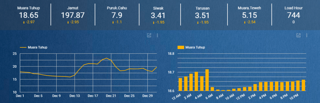
This dashboard contains information on the water level of some critical areas along the Barito River and some weather parameters that can affect the river water level.

Here is the explanation of the charts used in the dashboard:
Scorecards
It displays a summary of a single metric, commonly used to visualize key performance indicators like some variables that measure the relative health or performance of your business or area of activity.
For example, the scorecard in this project was used to show the summary of the average water level and weather conditions of each place.
Line Chart
It shows how data changes over a period of time.
For example, the line chart or time series chart was used to represent the water level data of each place from 1 December 2020 until 31 December 2020.
Bar Chart
It uses horizontal or vertical bars to show comparisons among categories, the longer the bar, the greater the value it represents.
For example, the bar chart was used to compare the water level of each hour and compare weather conditions of each place.
Geo Maps
This chart provides an easy way to visualize a measurement across geographic areas.
For example, geo maps were used to visualize the temperature level of each place.
There is still a lot to cover about the type of charts and the suitability of each of them — understanding how best to present a piece of information that takes into account contextual factors warrant a separation section all on its own — so stay tuned!
Google Data Studio’s Most Useful Features
I would like to share some features of Google Data Studio that I found very useful to help us generate reports or dashboards faster:
Blended Data Source
By default, charts in Data Studio get their information from a single data source. Blending lets you create charts based on multiple data sources, and it can also be called a blended data source.
For example, you can blend two different Google Analytics data sources to measure the performance of your app and website in a single visualization.
Blending can reveal valuable relationships between your datasets. Creating blended charts directly in Data Studio removes the need to manipulate your data in other applications first, saving you time and effort.

Calculated Field
Calculated Field allows the user to create new or custom metrics or dimensions in Google Data Studio from the existing data.
Perform calculations, create categories, and transform data can be done using this feature.
This is more effective than editing the dataset and uploading it back to the data connector. There is also a feature to create formulas using the function from Function List:

Present Report
Google Data Studio can also present the dashboard or reports that have been made as a presentation. This presentation can be shown in full screen, or in a normal browser window, much like what is on offer by Google Slides.
There is also an option to automatically display each page of the report for a specified amount of time.
For example, you can present a 10-page report and choose to show each page for a minute before automatically advancing to the next page.

That’s all for now, I hope this article can be useful for your future work! See you in the next part, where we will talk about the comparisons between data visualization tools!