In the previous article (part 3), we have build a streaming data pipeline using Kafka and Spark Streaming to ingest and process transactional data streams. We successfully loaded the proceesed raw transactional data into the Cassandra database, and loaded the aggregated transactional data into the MySQL database.
In this article, we dive into the analytical aspect by performing insightful query on the aggregated transactional data stored in the MySQL database. Additionally, we will create a simple (near) real-time dashboard to visualize the sales and profit data in an intuitive manner. By combining analytics and visualization, we can easily explore and interpret the data, enabling us to monitor the performance of the business and make data-driven decisions.
We will create our dashboard using Streamlit, which is an open-source Python library to build custom web apps. Streamlit is a great tool for quickly building and sharing data applications, and it is quite straightforward to use due to its extensive documentation and intuitive API. In addition to Streamlit, we will utilize Altair, a powerful visualization library, to create interactive and visually appealing charts within our dashboard. If you wish to learn more about Altair, feel free to check out the video series by Samuel Chan, which covers the fundamental and advanced concepts of Altair.
Analyzing Data in MySQL
Assuming you have followed the previous article (part 3), and have successfully loaded the aggregated transactional data into the MySQL database, we can now perform some analytical queries on the data. To proceed, ensure that the Docker containers for all specified services in the Docker Compose file are running. If the containers are not running, execute the following command to start them:
docker-compose up -dNext, we will access the MySQL container and launch the MySQL shell by executing the following command:
docker exec -it mysql mysql -u root -pEnter root as the password (as specified in the docker-compose.yml file) when prompted. Now, we will navigate to the sales database and check several rows
of the aggregated_sales table. To do so, execute the following commands:
USE sales;
SELECT * FROM aggregated_sales LIMIT 3;
You should see an output similar to the following:
| processing_id | processed_at | order_date | platform_id | product_id | total_quantity |
|---------------|---------------------|-------------|-------------|------------|----------------|
| 1 | 2023-06-18 07:05:00 | 2023-06-18 | 1 | 9 | 16 |
| 2 | 2023-06-18 07:05:00 | 2023-06-18 | 4 | 16 | 9 |
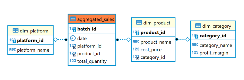
| 3 | 2023-06-18 07:05:00 | 2023-06-18 | 3 | 7 | 4 |And to recap the relational schema of the sales database, you can refer to the ER diagram presented below:
Now, let’s begin our data analysis. To facilitate the analysis process, we will utilize view in MySQL. View is a virtual table that is derived from the result of a query. It does not store any data, but rather, it is a stored query that can be treated as a table. View is an excellent choice for our needs as they allow us to reuse the same query multiple times without having to rewrite the query each time. We will create a view named sales_and_profit_today that contains the total sales and profit generated across different platforms and categories on the current day. To create the view, execute the following command:
CREATE VIEW sales_and_profit_today AS
    SELECT dpl.platform_name, dc.category_name,
        SUM((dpr.cost_price + (dpr.cost_price * dc.profit_margin)) * ags.total_quantity) AS total_sales,
        SUM((dpr.cost_price * dc.profit_margin) * ags.total_quantity) AS total_profit
    FROM aggregated_sales AS ags
    JOIN dim_platform AS dpl ON ags.platform_id = dpl.platform_id
    JOIN dim_product AS dpr ON ags.product_id = dpr.product_id
    JOIN dim_category AS dc ON dpr.category_id = dc.category_id
    WHERE ags.order_date = CURDATE()
    GROUP BY dpl.platform_name, dc.category_name;
Creating a view is a straightforward process. We start by using the CREATE VIEW statement followed by the query that defines the view. In this case, our goal is to calculate the total sales and profit for each platform and category on the current day. To achieve this, we need to do two calculations:
- Total sales is calculated by multiplying the selling price of each product by the total quantity sold. The selling price of each product is represented as
cost_price + (cost_price * profit_margin)because earlier we defined theprofit_marginas a decimal value relative to thecost_price. - Total profit is calculated by multiplying the profit of each product by the total quantity sold. The profit of each product is represented as
cost_price * profit_margin.
To gather the necessary data, we perform joins between the aggregated_sales, dim_platform, dim_product, and dim_category tables. These joins allow us to link the sales data with the respective platform, product, and category details. Additionally, we filter the rows based on the current date using the CURDATE() function. Finally, we group the data by the platform_name and category_name to obtain the total sales and profit for each platform and category.
You can access the views we have created similar to how you would access a table. So to access the sales_and_profit_today view, simply execute the following command:
SELECT * FROM sales_and_profit_today;You should see an output similar to the following:
| platform_name | category_name | total_sales | total_profit |
|---------------|---------------|-------------|--------------|
| MarketPlaceX  | Personal Care |    946.0000 |      86.0000 |
| MarketPlaceX  | Jewelry       |  59425.0000 |   11885.0000 |
| MarketPlaceX  | Clothing      |   4939.2500 |     644.2500 |
| MarketPlaceX  | Shoes         |  16404.0000 |    2734.0000 |
| EasyShop      | Clothing      |   6434.2500 |     839.2500 |
| EasyShop      | Shoes         |  11520.0000 |    1920.0000 |
| EasyShop      | Jewelry       |  50400.0000 |   10080.0000 |
| EasyShop      | Personal Care |    720.5000 |      65.5000 |
| BuyNow        | Jewelry       |  30462.5000 |    6092.5000 |
| BuyNow        | Shoes         |  11160.0000 |    1860.0000 |
| BuyNow        | Clothing      |   5008.2500 |     653.2500 |
| BuyNow        | Personal Care |    726.0000 |      66.0000 |
| SwiftMart     | Clothing      |   6095.0000 |     795.0000 |
| SwiftMart     | Jewelry       |  61787.5000 |   12357.5000 |
| SwiftMart     | Personal Care |    841.5000 |      76.5000 |
| SwiftMart     | Shoes         |   7848.0000 |    1308.0000 |
Note that by keeping the producer.py script and the Spark Streaming application running (refer to the previous article), our data are processed in a streaming manner. Consequently, the result of sales_and_profit_today view will be continuously updated as new data is ingested, processed, and loaded into the aggregated_sales table. This allows us to perform (near) real-time analysis, where insights and conclusions can be derived from the most up-to-date data available.
Now that we have created the view, we can proceed to visualize the data. In the next section, we will demonstrate the process of building a (near) real-time dashboard using Streamlit and Altair. By utilizing these tools, we can effectively present the data in a visually appealing and interactive manner.
Creating a Dashboard with Streamlit and Altair
Our goal is to visualize the view we have created in the previous section. We will design a dashboard that consists of four bar charts, each representing the total sales and profit for each platform and category.
First, we need to install the necessary packages in our virtual environment (the one we created in the previous article). If you have not activated the virtual environment, you can do so by executing the following command in the project directory:
source ./project_env/bin/activateThen we will install the packages using the following command:
sudo apt-get update
sudo apt-get install python3-dev default-libmysqlclient-dev build-essential
python -m pip install mysqlclient==2.1.1 sqlalchemy==2.0.16 streamlit==1.23.1 pandas==2.0.2 altair==5.0.1
Note that python3-dev, default-libmysqlclient-dev, and build-essential are the dependencies and development libraries required to install mysqlclient. mysqlclient and sqlalchemy are the packages required to connect our Streamlit application to the MySQL database. Besides streamlit and altair, we also install pandas to help us with data manipulation and analysis.
Next, we’ll proceed with the creation of the necessary files and folders in the project directory. We will start by creating a new folder called dashboard. Inside the dashboard folder, we’ll create a file named app.py which will contain the code for our Streamlit application. Additionally, we need to create a subfolder within dashboard called .streamlit. This subfolder will house a configuration file named secrets.toml for our Streamlit application. You can accomplish this either through the user interface or by executing the following commands in your project directory:
mkdir dashboard
cd dashboard
touch app.py
mkdir .streamlit
cd .streamlit
touch secrets.toml
By executing these commands, you will successfully create the required files and folders in your project directory. And now, your project directory should look like this:
streaming_data_processing
├── docker-compose.yml
├── producer.py
├── spark-defaults.conf
├── dashboard
│   ├── app.py
│   └── .streamlit
│       └── secrets.toml
├── project_env
└── spark_script
    └── data_streaming.py
Next, we will configure the secrets.toml file. This file will contain the credentials required to connect to the MySQL database. Open the secrets.toml file and add the following lines:
[connections.mysql]
dialect = "mysql"
host = "127.0.0.1"
port = 3307
database = "sales"
username = "root"
password = "root"
Note that the port is set to 3307 instead of the default port 3306. This is because we have configured the port mapping to "3307:3306" for the mysql container in the docker-compose.yml file, so we need to access the MySQL database through port 3307 on the host machine.
Now, we can proceed with the implementation of the dashboard in the Streamlit application. Open the app.py file and add the following lines:
import datetime as dt

import altair as alt
import pandas as pd
import streamlit as st

st.set_page_config(layout='wide', page_title='Profit and Sales Dashboard')

def get_view_data(view_name):
    # Connect to the database and retrieve the view data in a dataframe
    conn = st.experimental_connection('mysql', type='sql')
    view_df = conn.query(f'SELECT * FROM {view_name};', ttl=60)
    return view_df

def agg_view_data(view_df, groupby_key):
    # Aggregate the sum of sales and profit by the groupby key
    result_df = view_df.groupby(groupby_key).agg({'total_sales': 'sum', 'total_profit': 'sum'}).reset_index()
    return result_df

def visualize_df_by_col(df, col_name, title, color):
    # Visualize the dataframe in a bar chart by the column name
    chart = alt.Chart(df).mark_bar(color=color).encode(
                x=alt.X(col_name, axis=alt.Axis(title='USD')),
                y=alt.Y(df.columns[0], sort='-x', axis=alt.Axis(title=None))
            ).properties(
                height=300,
                width=450,
                title=title)

    st.altair_chart(chart, use_container_width=False)

today = dt.date.today().strftime("%Y-%m-%d")
title = f"Profit and Sales Dashboard: {today}"
st.header(title)

view_df = get_view_data('sales_and_profit_today')
platform_df = agg_view_data(view_df, "platform_name")
category_df = agg_view_data(view_df, "category_name")

col1, col2, col3 = st.columns([4, 2, 4])

with col1:
    st.metric(label='Total Sales (USD)', value=view_df['total_sales'].sum())
    visualize_df_by_col(category_df, 'total_sales', 'Total Sales by Category Today', 'cyan')
    visualize_df_by_col(platform_df, 'total_sales', 'Total Sales by Platform Today', 'cyan')

with col3:
    st.metric(label='Total Profit (USD)', value=view_df['total_profit'].sum())
    visualize_df_by_col(category_df, 'total_profit', 'Total Profit by Category Today', 'orange')
    visualize_df_by_col(platform_df, 'total_profit', 'Total Profit by Platform Today', 'orange')
Let’s walk through the code section by section to gain a better understanding of the implementation.
First, we set the page configuration for our Streamlit application, including the layout and the page title shown in the browser tab.
st.set_page_config(layout='wide', page_title='Profit and Sales Dashboard')Next, we define a function called get_view_data that takes in the name of a view as an argument and returns the data in the view as a dataframe.
def get_view_data(view_name):
    # Connect to the database and retrieve the view data in a dataframe
    conn = st.experimental_connection('mysql', type='sql')
    view_df = conn.query(f'SELECT * FROM {view_name};', ttl=60)
    return view_df
The function establishes a connection to the MySQL database by using st.experimental_connection, which handles secrets retrieval (based on the credentials specified in the secrets.toml file), setup, query caching and retries. Once the connection is established, the function executes a query to retrieve all the data from the specified view. The ttl argument specifies the duration for which the query results will be cached. Since our microbatch processing interval for the aggregated data is 60 seconds, we set the ttl to 60 seconds as well, indicating that the query results will be cached for 60 seconds before a new query is executed.
Here is a preview of the first 10 rows of the dataframe returned by the get_view_data function:
| platform_name | category_name | total_sales | total_profit | |
|---|---|---|---|---|
| 0 | MarketPlaceX | Personal Care | 1,474 | 134 |
| 1 | MarketPlaceX | Clothing | 5,019.75 | 654.75 |
| 2 | MarketPlaceX | Shoes | 24,228 | 4,038 |
| 3 | MarketPlaceX | Jewelry | 49,875 | 9,975 |
| 4 | EasyShop | Personal Care | 2,057 | 187 |
| 5 | EasyShop | Jewelry | 62,362.5 | 12,472.5 |
| 6 | EasyShop | Clothing | 10,447.75 | 1,362.75 |
| 7 | EasyShop | Shoes | 11,808 | 1,968 |
| 8 | BuyNow | Shoes | 11,016 | 1,836 |
| 9 | BuyNow | Clothing | 7,107 | 927 |
Next, we define a function called agg_view_data that takes in a dataframe and a groupby key arguments and returns a new dataframe that contains the aggregated sum of sales and profit by the specified groupby key.
def agg_view_data(view_df, groupby_key):
    # Aggregate the sum of sales and profit by the groupby key
    result_df = view_df.groupby(groupby_key).agg({'total_sales': 'sum', 'total_profit': 'sum'}).reset_index()
    return result_df
Here is a preview of the dataframe returned by the agg_view_data function with the groupby_key set to platform_name:
| platform_name | total_sales | total_profit | |
|---|---|---|---|
| 0 | BuyNow | 83,824 | 15,674 |
| 1 | EasyShop | 86,675.25 | 15,990.25 |
| 2 | MarketPlaceX | 80,596.75 | 14,801.75 |
| 3 | SwiftMart | 65,316.5 | 11,941.5 |
Next, we define a function called visualize_df_by_col that takes in a dataframe, a column name, a title and a color as arguments and visualizes the dataframe in a bar chart by the specified column name.
def visualize_df_by_col(df, col_name, title, color):
    # Visualize the dataframe in a bar chart by the column name
    chart = alt.Chart(df).mark_bar(color=color).encode(
                x=alt.X(col_name, axis=alt.Axis(title='USD')),
                y=alt.Y(df.columns[0], sort='-x', axis=alt.Axis(title=None))
            ).properties(
                height=300,
                width=450,
                title=title)

    st.altair_chart(chart, use_container_width=False)
Here is the breakdown of the code to generate the bar chart using Altair:
- The
alt.Chartfunction creates a base chart object. Thedfparameter represents the dataframe that will be used as the data source for the chart. - The
mark_bar(color=color)indicates that the chart is a bar chart with the specified color. - The
encodefunction is used to specify the x and y axes of the chart:- The x-axis is mapped to the column name specified by the
col_nameparameter. The title of the x-axis is set to ‘USD’. - The y-axis is mapped to the first column of the dataframe (which is either
platform_nameorcategory_namein our case). Thesortargument is set to ‘-x’ to sort the y-axis in descending order. The title of the y-axis is set toNone.
- The x-axis is mapped to the column name specified by the
- The
propertiesfunction is used to specify the height, width and title of the chart.
At the end of the function, the chart is displayed in the Streamlit application using the st.altair_chart function. The use_container_width argument is set to False to use a fixed width of 450 for the chart.
Here is an example of the bar chart generated from visualize_df_by_col(category_df, 'total_sales', 'Total Sales by Category Today', 'cyan'):

Finally, we design the structure of the dashboard using the code below.
today = dt.date.today().strftime("%Y-%m-%d")
title = f"Profit and Sales Dashboard: {today}"
st.header(title)

view_df = get_view_data('sales_and_profit_today')
platform_df = agg_view_data(view_df, "platform_name")
category_df = agg_view_data(view_df, "category_name")

col1, col2, col3 = st.columns([4, 2, 4])

with col1:
    st.metric(label='Total Sales (USD)', value=view_df['total_sales'].sum())
    visualize_df_by_col(category_df, 'total_sales', 'Total Sales by Category Today', 'cyan')
    visualize_df_by_col(platform_df, 'total_sales', 'Total Sales by Platform Today', 'cyan')

with col3:
    st.metric(label='Total Profit (USD)', value=view_df['total_profit'].sum())
    visualize_df_by_col(category_df, 'total_profit', 'Total Profit by Category Today', 'orange')
    visualize_df_by_col(platform_df, 'total_profit', 'Total Profit by Platform Today', 'orange')
First we set the dashboard title using st.header, which includes the current date. This title is positioned at the top of the dashboard. Then, we retrieve the data from the sales_and_profit_today view using the get_view_data function. We then aggregate the sum of profit and sales data by platform and category, using the agg_view_data function.
We define the layout of the dashboard by using the st.columns component, which allows us to create multiple columns. We specify three columns, with the first and third columns having a width ratio of 4 and the second column having a width ratio of 2. Finally, we populate the first column with a metric showing the total sales using the st.metric function, and two bar charts showing the total sales by category and platform using the visualize_df_by_col function. Similarly, we populate the third column with a metric showing the total profit metric and two bar charts showing the total profit by category and platform.
Now, let’s run the Streamlit app and see the dashboard in action. Execute the following command in the project directory:
cd dashboard
streamlit run app.py
You should see an output similar to the following:
You can now view your Streamlit app in your browser.

Network URL: http://172.17.6.104:8501
External URL: http://111.94.72.117:8501
To access the Streamlit app, simply copy the Network URL and paste it into your browser. You should see a dashboard similar to the one below in your browser:
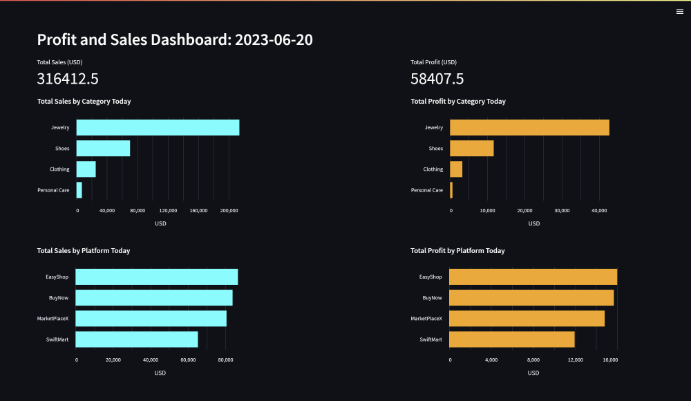
If you keep the producer.py script and the Spark Streaming application running (refer to the previous article), the result of sales_and_profit_today view will be continuously updated as new data is ingested, processed, and loaded into the aggregated_sales table. Therefore, the dashboard will also be updated with the latest data.
Here is another preview of the dashboard after a while:

Notice that the total sales and profit metrics have increased, and the bar charts have been updated accordingly. To see the updated data on the dashboard, you’ll need to refresh the page. Keep in mind that the get_view_data function caches the query result for 60 seconds, so there might be a slight delay before the dashboard reflects the latest data stored in the sales_and_profit_today view.
If you are done with exploring the dashboard, you can stop the Streamlit app by pressing Ctrl + C in the terminal. And if you are done with the project, you can stop the Docker containers by running the following command in the project directory:
docker compose stopConclusion
Since we have reached the end of this article, we have also reached the end of our project. To recap, here is a summary of our project:
- In the first article, we discussed the project overview set up the project environment by utilizing Docker Compose.
- In the second article, we implemented an OLTP database using Cassandra and an OLAP database using MySQL. The OLTP database is used to store the raw transactional data, while the OLAP database is used to store the aggregated data.
- In the third article, we developed a data pipeline that utilizes Kafka and Spark Streaming to ingest and process transactional data streams. The processed data is subsequently loaded into the OLTP and OLAP databases.
- Lastly, in this fourth article, we conducted data analysis on the aggregated transactional data stored in the OLAP (MySQL) database. Our analysis involved creating a view that aggregates the total sales and profit figures for each platform and category on the current day. To further facilitate data exploration, we developed an interactive and dynamic dashboard using Streamlit. This dashboard allows users to visualize and analyze the total sales and profit data from different perspectives, categorized by both platform and category. With these visualizations, we enable data-driven decision-making and provide a comprehensive overview of the ongoing business performance.